Revolut Shared Pouch
INTRODUCTION
Traditional bill-splitting is typically reactive: one person fronts the cost and then manually chases others to reimburse them. This dynamic often creates social friction and places financial risk on the person acting as the “paymaster.”
The challenge, then, is to move beyond this model by designing a proactive, shared financial space where accountability is built into the system—automating how expenses are tracked and settled—while avoiding the legal and administrative barriers associated with opening a joint bank account.
The Legal Puzzle
To innovate in fintech, you must design within rigid compliance frameworks. Hiring managers don't just want UI; they want systemic logic.
- The Regulatory Wall: Opening multiple joint accounts is a KYC (Know Your Customer) and AML (Anti-Money Laundering) nightmare for banks.
- The "Anchor" Solution: We designated one "Anchor" (The legal owner) who holds the funds, while "Guests" are granted spending permissions through a Shadow Ledger.
- The Innovation: We designed a "Light KYC" onboarding for non-Revolut users, allowing them to join the ecosystem in under 60 seconds while remaining legally compliant.
The People:
We mapped who would be the users of this product.
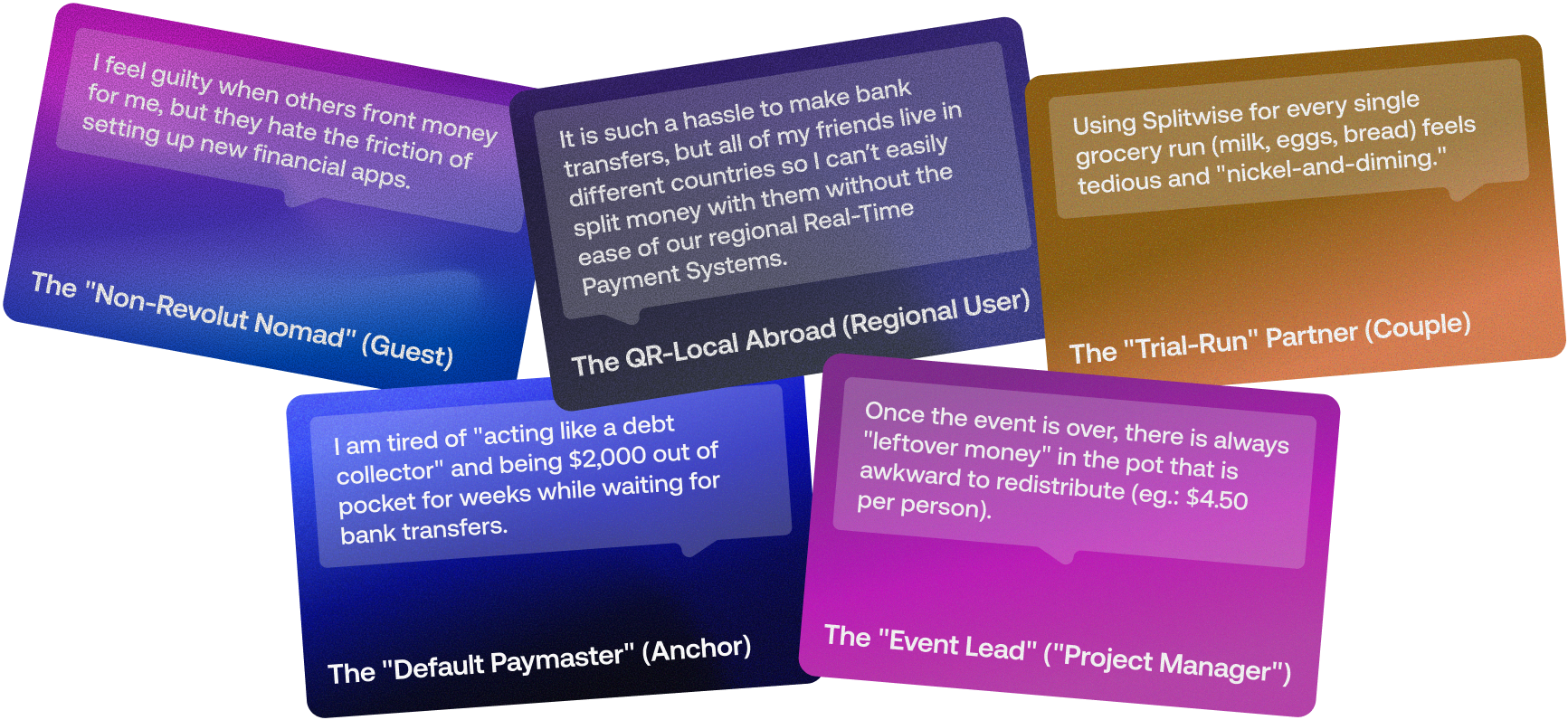
- The Use Case: "Digital Nomads" and "Group Travelers.
- The Pain Point:: Users expressed a clear friction point: "I don't want to owe my friends 500€ for a week-long trip, and I don't want to wait 3 days for a bank transfer to clear.
- The Solution: Real-time funding pools mapped to interchangeable virtual cards, turning a shared balance into instant purchasing power.
PROTOPERSONAS & ARCHETYPES
The Bucket-Lister
Books months in advance for "peace of mind." Treats Fado as a highlight event. Needs reliability.
The City Wanderer
Already in Lisbon. Decides based on mood or weather. Books on mobile while walking for the same day.
The Heritage Seeker
Speaks the language or seeks deep emotional connection. Wants "real" Portugal, avoids tourist traps.
Logic & Craft
Technical Precision
We analyzed competitors like Adega Machado (low friction, modern) and O Faia (high authority, traditional) to find a "Middle Path" to balance both worlds.
Accessibility
To meet corporate standards, I integrated vital "Design Ops" notes, such as explicit warnings about wheelchair accessibility and clear transportation/parking guides for foreign drivers.
Steps Taken
- Discovery & Research: Interviewed staff, analyzed competitors, and gathered insights from existing customers.
- Information Architecture: Restructured the website’s map to highlight the menu, Fado artists, and booking.
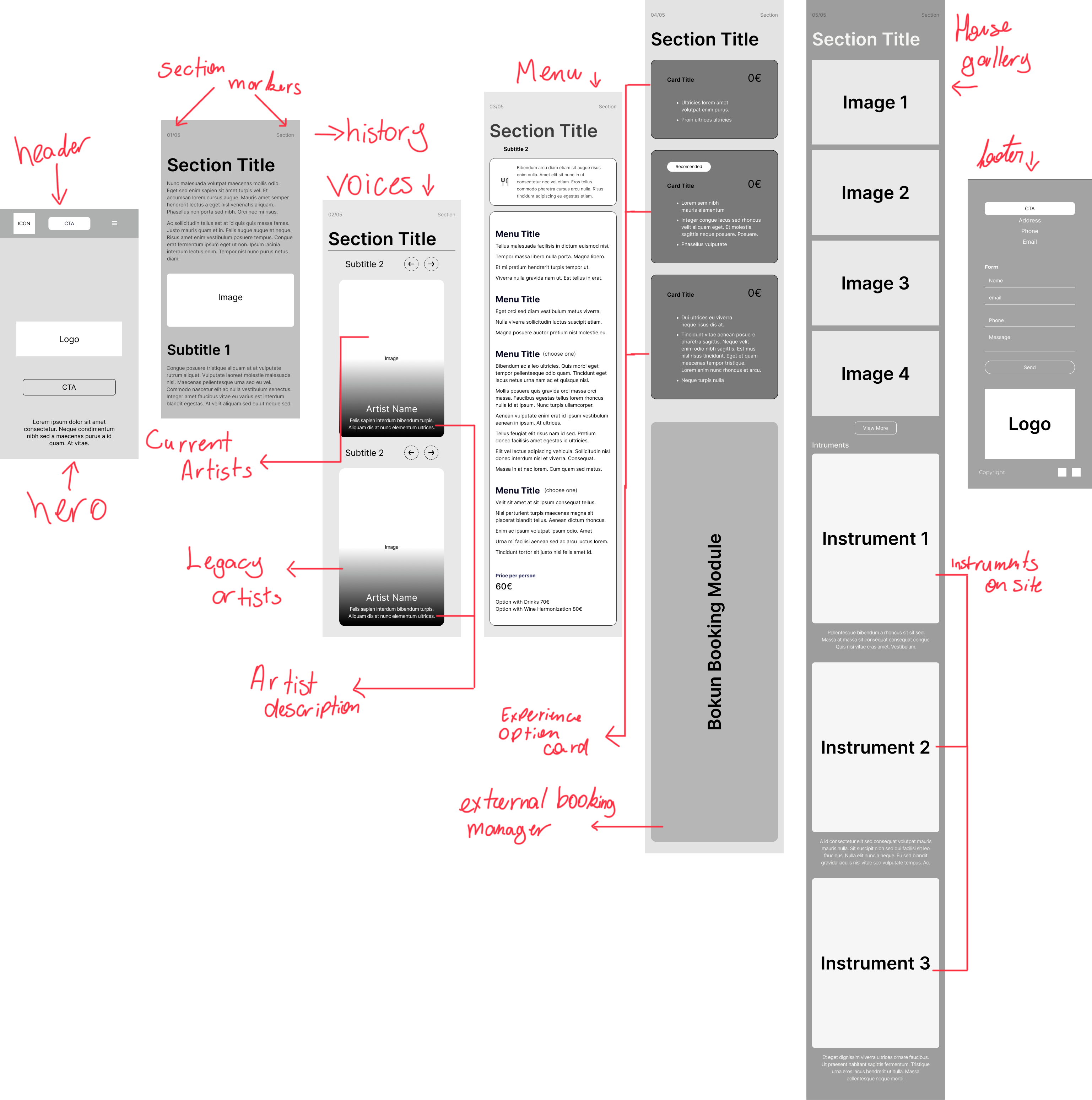
- Wireframing: Created low-fidelity flows to establish the structural foundation and validate assumptions.
- Visual Design: Developed a dark, moody UI paired with elegant typography evoking the spirit of Fado.
- Prototyping & Testing: Built interactive prototypes in Figma for user testing, refining the booking process based on feedback.
Wireframes
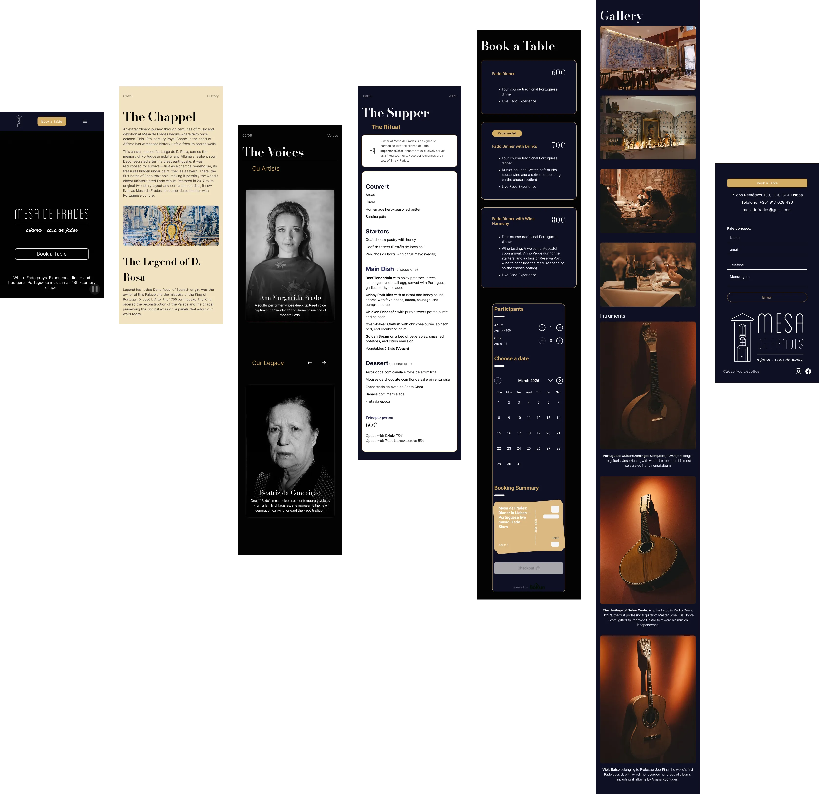
Final Design
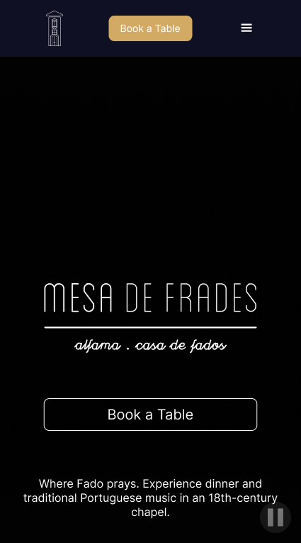
Hero Section
The landing experience immediately establishes the "soul" of the brand with the tagline "Where Fado prays". By framing the 18th-century chapel not just as a venue, but as a site of devotion, the design elevates a simple dinner into a cultural pilgrimage. The moody interface with a background video prioritizes a direct "Book a Table" call-to-action to capture high-intent users immediately.
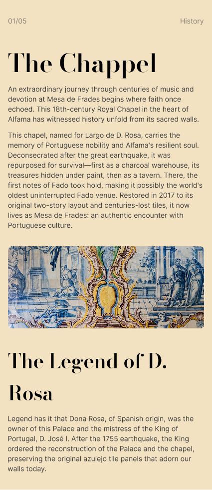
The Chapel
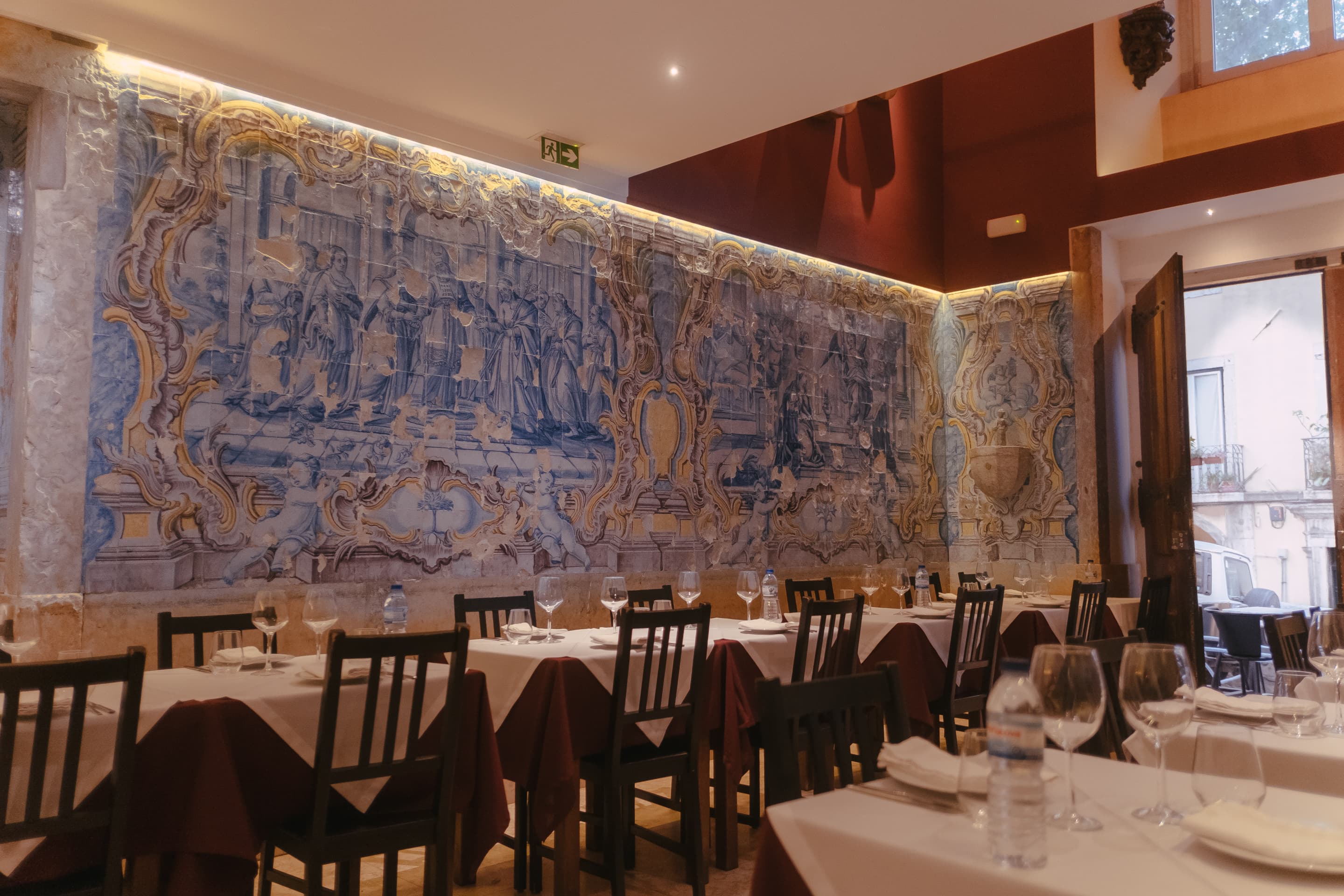
This section utilizes Architecture Information Design to transform historical data into a compelling journey. It guides the user through the 1755 earthquake and the legend of D. Rosa, using rich typography and high-fidelity images of original azulejo tiles to validate the venue’s authenticity as possibly the world's oldest uninterrupted Fado site.
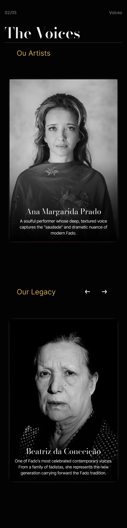
The Voices
This module shifts the focus from the architecture to the people. By categorizing artists into "Our Artists" (current performers like Ana Margarida Prado) and "Our Legacy" (historical figures like Beatriz da Conceição), the design builds immediate trust through institutional prestige and emotional storytelling.
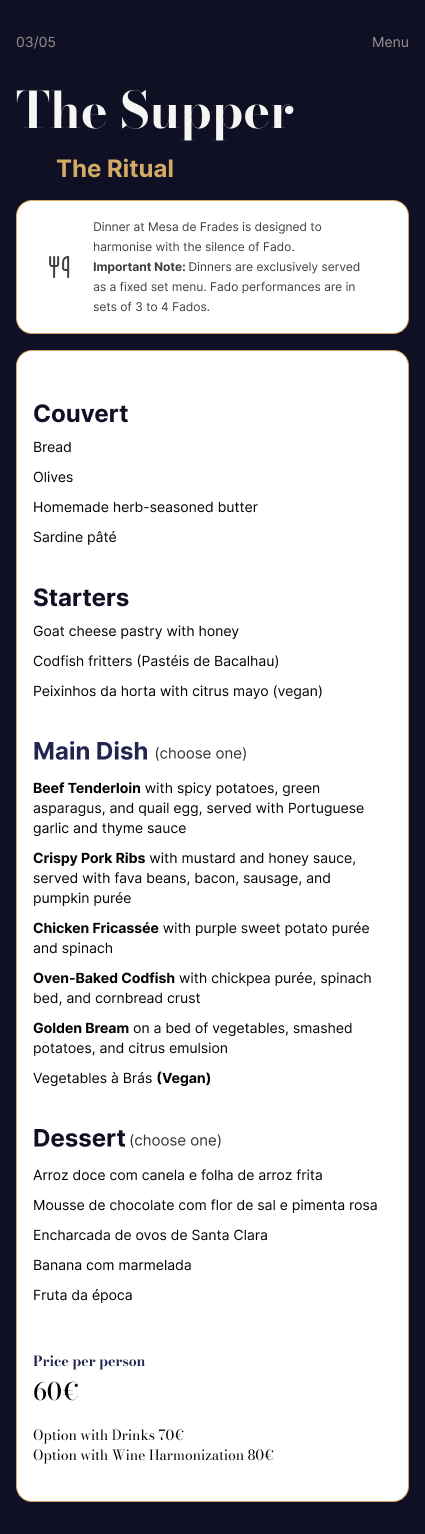
The Supper
Rather than a standard menu, this section is titled "The Ritual". It uses a clean, structured hierarchy to present a fixed set menu (60€) while managing user expectations with "Important Notes" regarding the silence of Fado and the specific timing of performances. This transparency reduces cognitive friction and potential on-site dissatisfaction.

The Booking Module
The final conversion point is a low-friction interface. It offers tiered pricing (60€ to 80€) with clear value differentiators (e.g., Wine Harmony). The interactive calendar and real-time checkout button are specifically optimized for the "City Wanderer" who requires an instant, mobile-first commitment.

The Gallery & Instruments
The gallery moves beyond generic interior shots to highlight the "Instruments". By featuring specific items like the 1970s Portuguese Guitar by Domingos Cerqueira, the design provides "Trust Signals" for the Heritage Seeker archetype, proving the venue’s commitment to the craft.
KEY INSIGHTS
This project reinforced my belief that digital design isn't just about functional utility; it's about translating real-world emotions into digital interfaces. Fado is a deeply emotional, soulful genre. By integrating subtle interactions, dark atmospheric backgrounds, and a focus on beautiful imagery, we created an online presence that accurately reflects the atmosphere inside Mesa de Frades.
Looking Back
What I Would Do Differently
If given more time, I would invest heavily in A/B testing the multi-tiered booking process earlier in the cycle. I'd implement deeper client interviews to validate the emotional response to the whole process committing to final UI states.
What I Learned
I learned the profound impact of "Trust Signals" when designing for cultural spaces. It's not enough to build a functional checkout; when selling an emotion or a ritual, the interface must validate the user's investment through careful storytelling, authentic imagery, and transparent operational guidelines to prevent dissatisfaction.